Enzosystems is one of the key independent providers of interactive check-in/out solutions for hotels: self check-in kiosks and online check-in web app.
EnzoSystems' existing website was outdated, cluttered, and failing to convert visitors into leads. The navigation was confusing, the visual design felt dated, and users struggled to understand the product's value proposition.
The company needed a modern, conversion-focused website that would better represent their innovative hospitality solutions and improve the overall user experience.
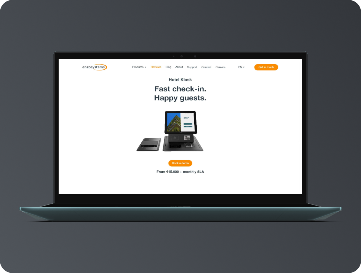
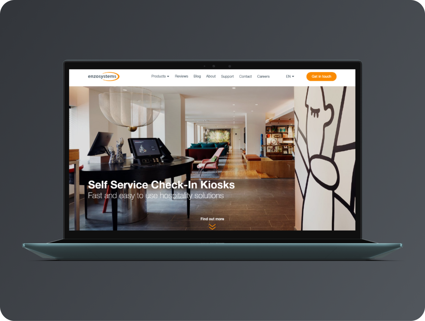
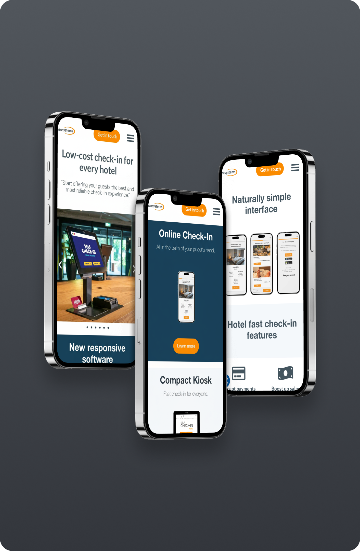
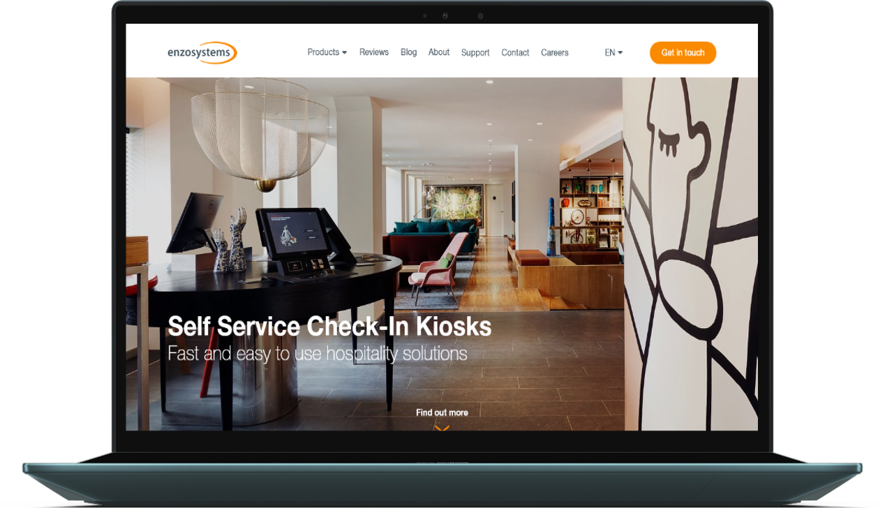
I conducted extensive user research, analyzed competitor websites, and redesigned the entire user experience from the ground up. The new design features a clear information hierarchy, modern visuals, and optimized conversion paths.
The redesign focused on simplicity, clarity, and guiding users toward key actions while maintaining the brand's professional identity in the hospitality industry.
My role
UX/UI Designer
Timeline
4 weeks (Q1 2025)
Team
1 Designer, 1 Developer
How might we redesign EnzoSystems' website to better communicate the product's value, improve user navigation, and increase conversion rates while establishing a modern, trustworthy brand presence in the hospitality industry?
Issue #1
Poor Navigation
Users couldn't find key information and bounced within 10 seconds
Issue #2
Outdated Design
Visual design didn't reflect the modern, innovative nature of the product
Issue #3
Low Conversion
Only 1.2% of visitors were signing up for demos or trials
Before

| Cluttered navigation with too many options | |
| Unclear value proposition above the fold | |
| Inconsistent typography and spacing | |
| Low contrast and accessibility issues | |
| Hidden or weak call-to-action buttons |
After
| Simplified navigation with clear hierarchy | |
| Clear, compelling headline and sub-headline | |
| Consistent design system and spacing | |
| WCAG AA compliant color contrast | |
| WCAG AA compliant color contrast |
1
Research
Conducted user interviews, analyzed analytics, and performed competitor analysis
2
Wireframing
Created low-fidelity wireframes to establish information architecture and layout
3
Design
Developed high-fidelity mockups with a new design system and visual identity
4
Testing
Conducted usability testing and iterated based on user feedback
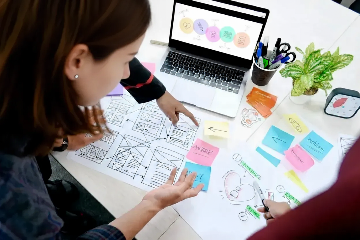
User Research
Interviewed 7 users to understand pain points and expectations
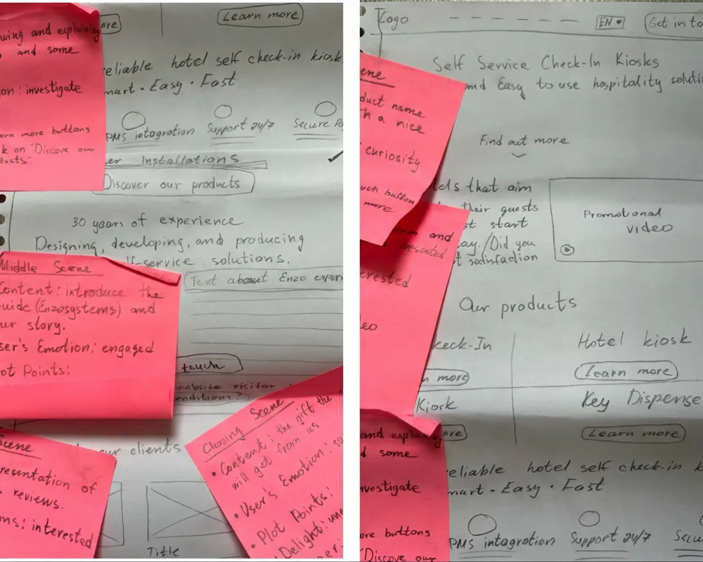
Wireframing
Created 20+ wireframes to explore different layout approaches
Modern geometric typography with high readability.

| HEX: | #414141 |
| RGB: | 65, 65, 65 |
| HEX: | #FA8A00 |
| RGB: | 250, 138, 0 |
| HEX: | #A5A5A5 |
| RGB: | 165, 165, 165 |
| HEX: | #FFFFFF |
| RGB: | 255, 255, 255 |
The redesign launched in March 2025 and the results exceeded expectations. Here are the key metrics after 3 months:
+284%
Increase in conversions
From 1,2% to 4,6% conversion rate
-47%
Reduced bounce rate
Users stay longer and engaging more
2.1s
Faster page load
Down from 5.4s average load time
"The redesign completely transformed our online presence. We're seeing more qualified leads, better engagement, and our sales team is thrilled with the quality of demo requests we're receiving. The new site perfectly captures what makes EnzoSystems special."
Rens de Vries,
Project Manager, EnzoSystems