TallY is a fintech-consumer platform for on-demand payments. We set out to create a straightforward payroll app so that customers can create new revenue streams with less complexity, stakeholders benefit, and the app remains competitive in the long run.
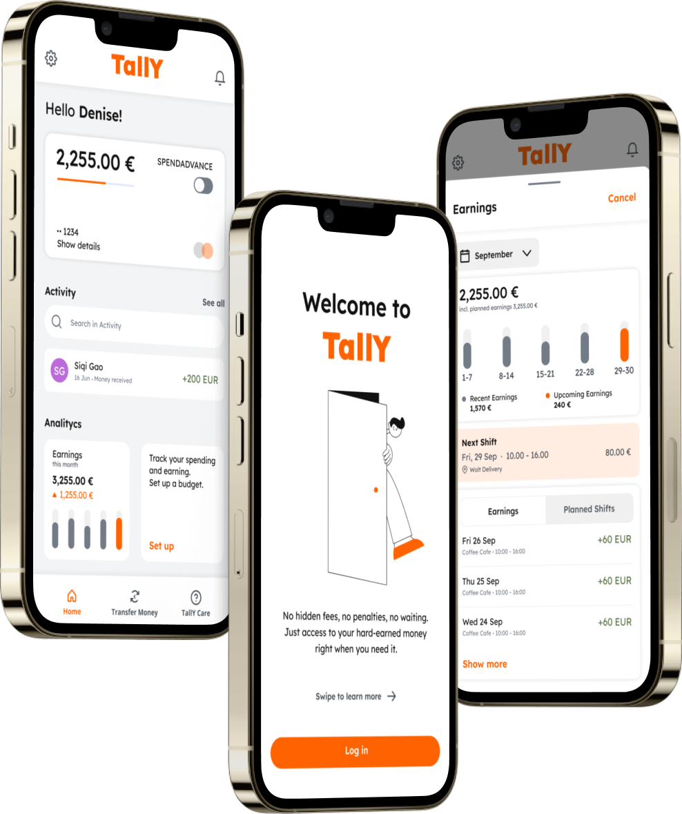
I was part of a team that consisted of a Visual Designer, a UX/UI Designer, a Product Owner, and two developers. I was responsible for UX/UI design and Product Design. For this project, I used the design thinking methodology: empathize, define, ideate, prototype, and test.
I delivered the entire UX process:
Our client approached us with two primary objectives:
We set out to create an app where people can get their on-demand wages and feel confident about their future. For the 1st MVP we ran 5 weeks of design sprints based on the design thinking methodology, which includes 5 stages: empathize, define, ideate, prototype and test.
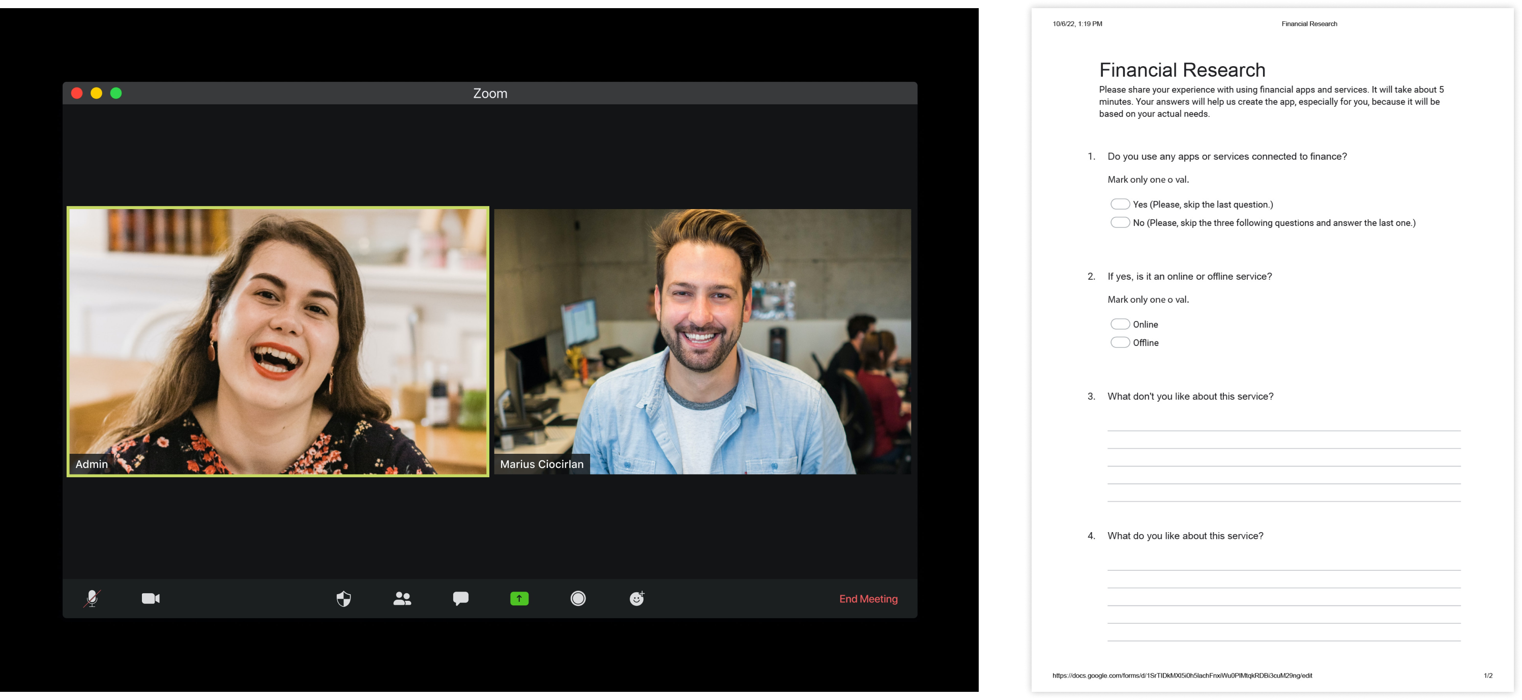
Meeting with stakeholders helped me to understand their ideas and business goals. They also shared their challenges. One of them was struggling with poverty. This is one of the United Nations Sustainable goals. Following this, I crafted an experience strategy outlining our phased approach and direction for the app. I set out to use a classical design thinking approach and an emotional design approach. Stakeholders wanted to make an easy-to-use app and turn it into a “financial friend.”
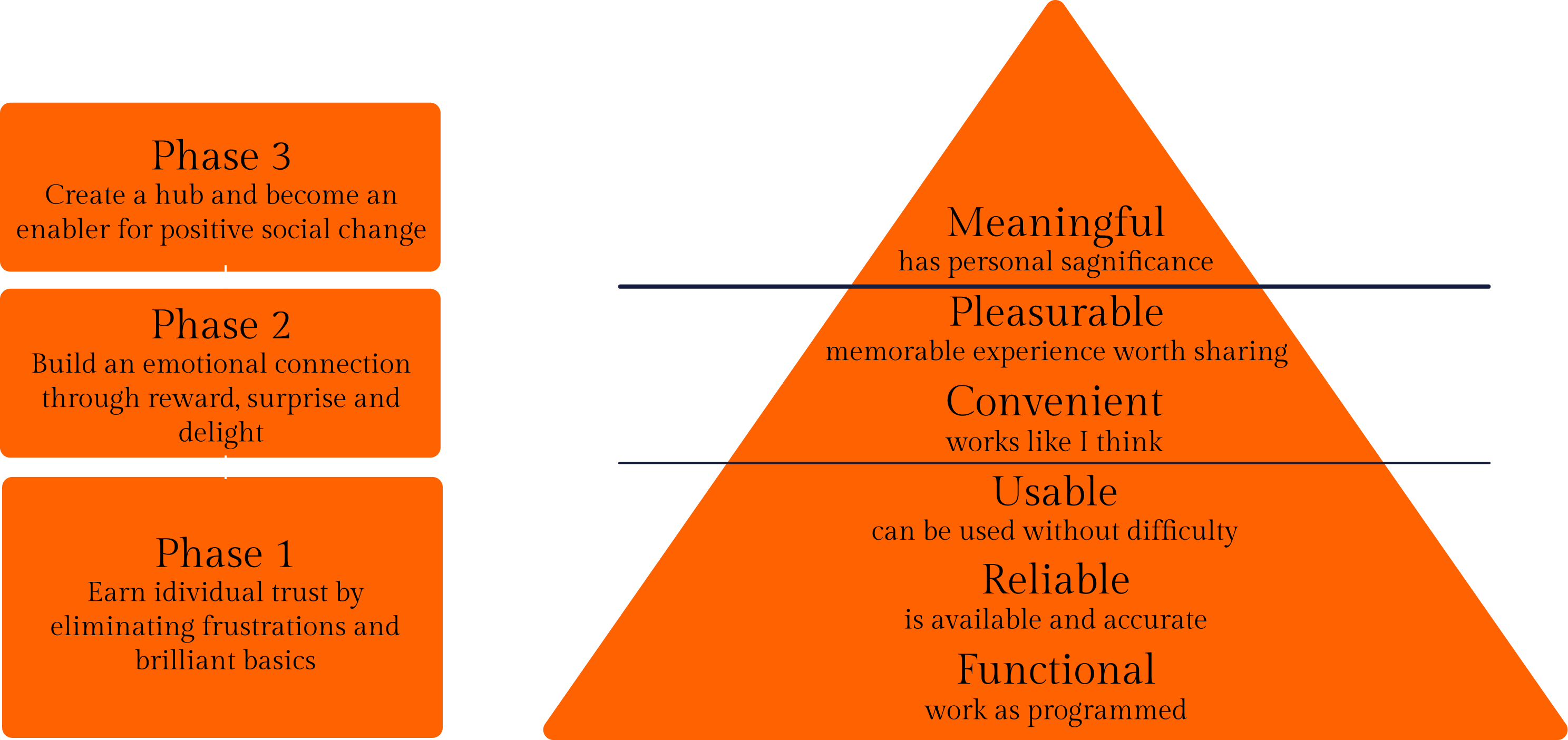
First of all, I wanted to understand if people from our target audience use financial apps and how they use them.
I created a survey with such questions:
Do you use any financial services?
I conducted a range of online interviews with five representatives of our target audience. Questions were based on the survey. I wanted to get some extended answers and hear more about why they use or don’t use financial apps and what they like and don’t like about them.
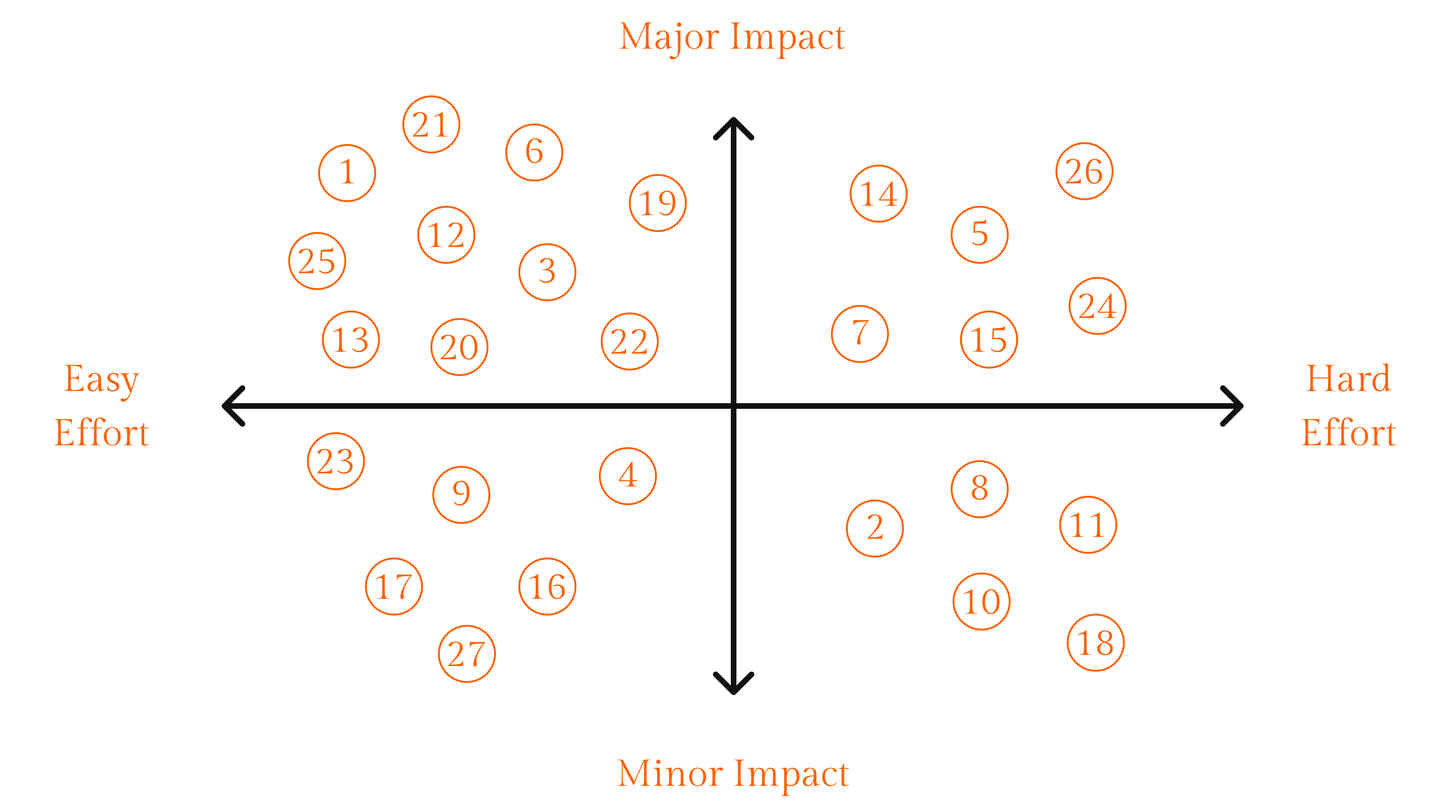
I analyzed data from the survey and user research interviews. I took quotes and notes from the interviews and wrote each of them on separate Post-its. Then, I reorganized them according to similarities, creating themes as I went along. I did the same with the data from the survey. Then I decided to make a competitive analysis. I discovered features that our competitors already have. I organized these features into different groups. Then I added data from the survey and user interviews. Finally, I got a list of 27 elements.

The next step was defining the best features to have in MVP 1. We organized a meeting with our developers and asked them to list important things to release the Beta version of the app.
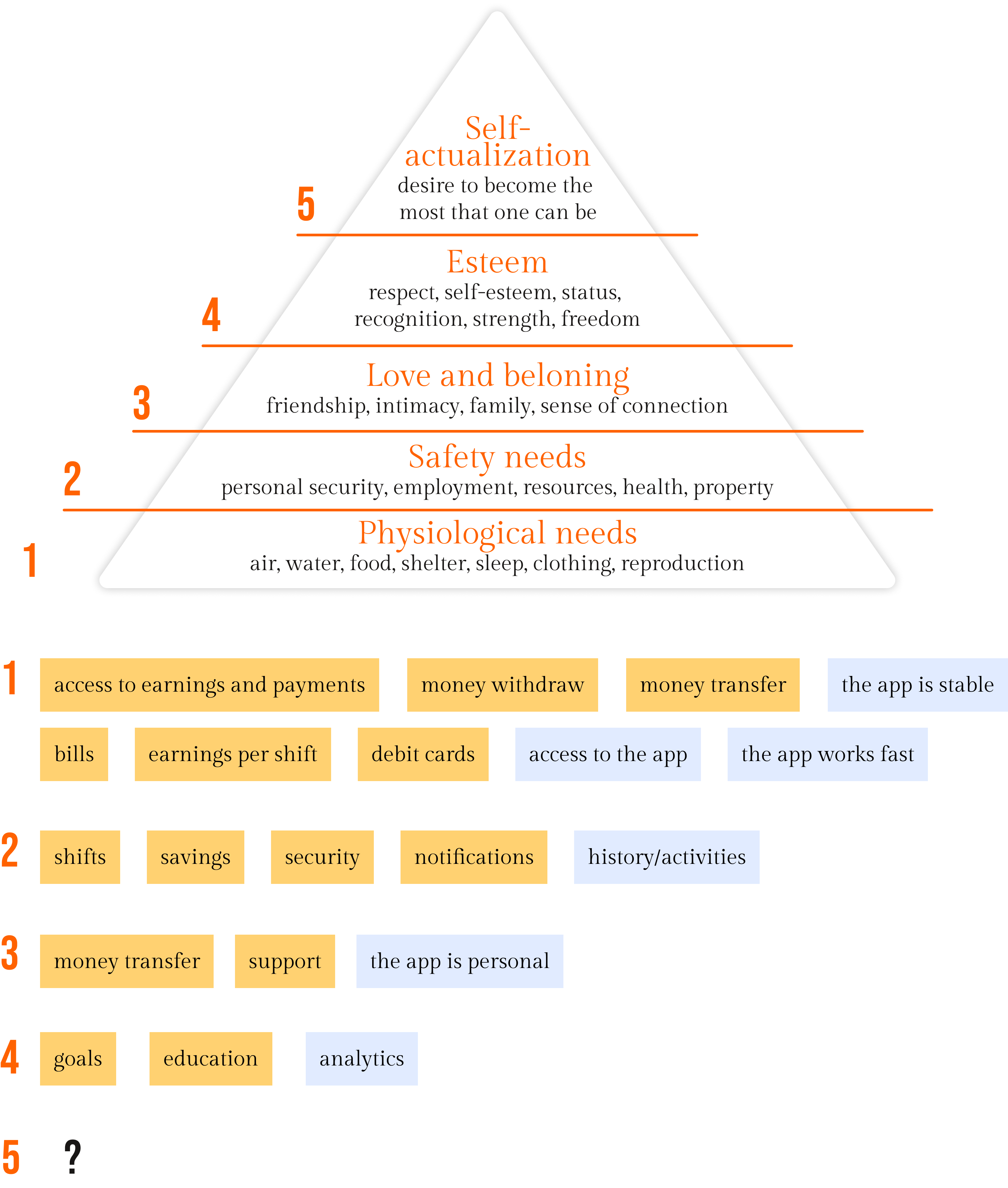
I sorted out the features according to the Maslow's hierarchy of needs.
I analyzed marketing data about target audience, and information, which I got during ideation sessions. Then I started to form a general idea about the various users within my focus area. I made an affinity diagram. This work helped me to see how users differ from one another and what common things they have.
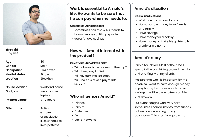
Through analysis of my research, I identified sufficient behavioral variables to segment our user audience. These variables could be categorized into activities such as frequency of use of the scheme, and motivations such as reasons for using advanced payments. I discussed the personas with stakeholders to develop a clear picture of who the design of the app would target in MVP 1.
I used personas constantly throughout the project to guide design decisions, priorities, and create empathy amongst stakeholders and our team.
Ideation session with our team was a great opportunity to collaborate and generate ideas and solutions for the future app.
I’ve analyzed data from the survey and user interviews. Then I made a set of questions. These questions helped our team to define essential parts of the app and what we should first think about.
We had to decide what features we needed for MVP 1. Together with our team, we created a prioritization matrix based on previous researches.
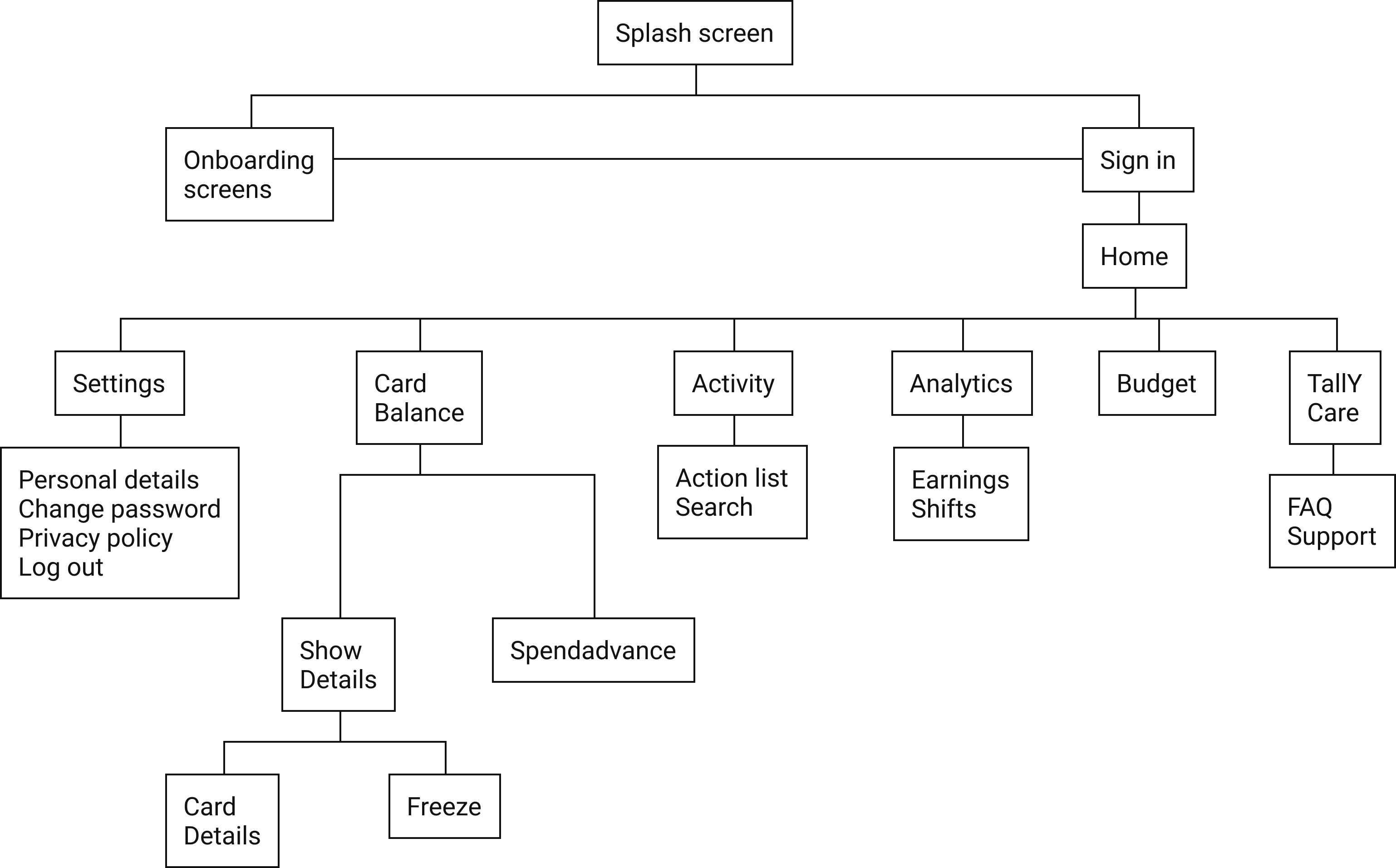
Then I finally got a chance to make a structure for MVP 1.
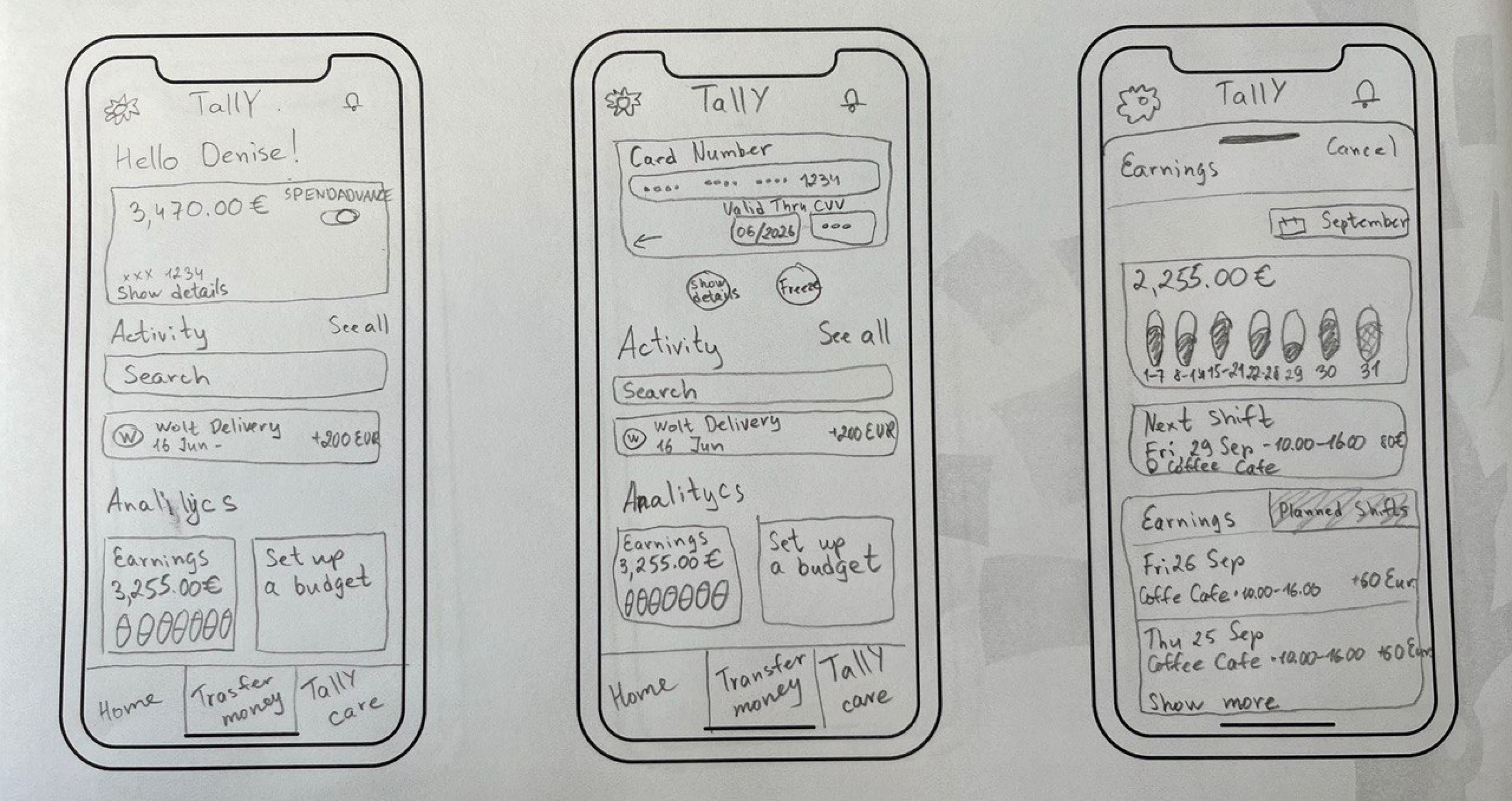
I made a sketch prototype to test our ideas and solutions quickly. I generated stacks of ideas about the arrangement of UI, functional and data elements, and interactive behaviors. Hurrah! Little pieces of this puzzle began to piece together.
I decided to conduct early testing sessions because it allows design components to be evaluated before extensive development efforts.
I chose the tree testing approach to test if the architecture and navigation hierarchy of the app was clear for the users.
I made a set of tasks and asked 5 representatives of the target audience to fulfill these tasks. I asked them to:
While they were fulfilling my tasks, I was trying to understand what was going through their minds. If the task was failed, I asked why things didn’t work and what was happening inside their heads.
After getting results from early testing and discussions with our team, we decided to make little changes to some features. I used Figma to create a high-fidelity prototype. The gallery below shows the final prototype for MVP 1.
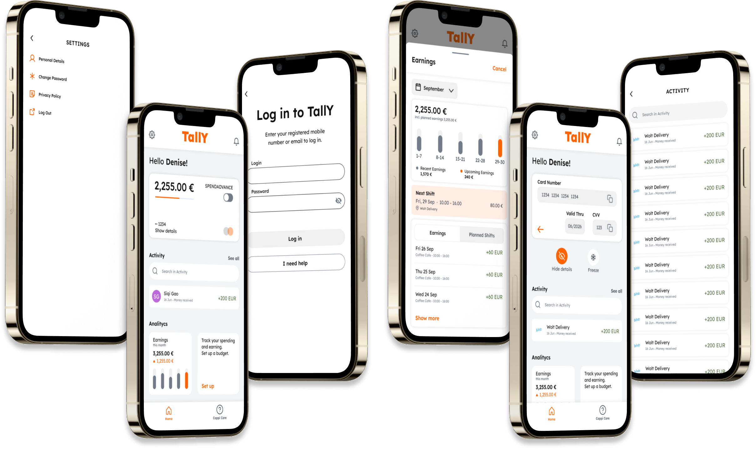
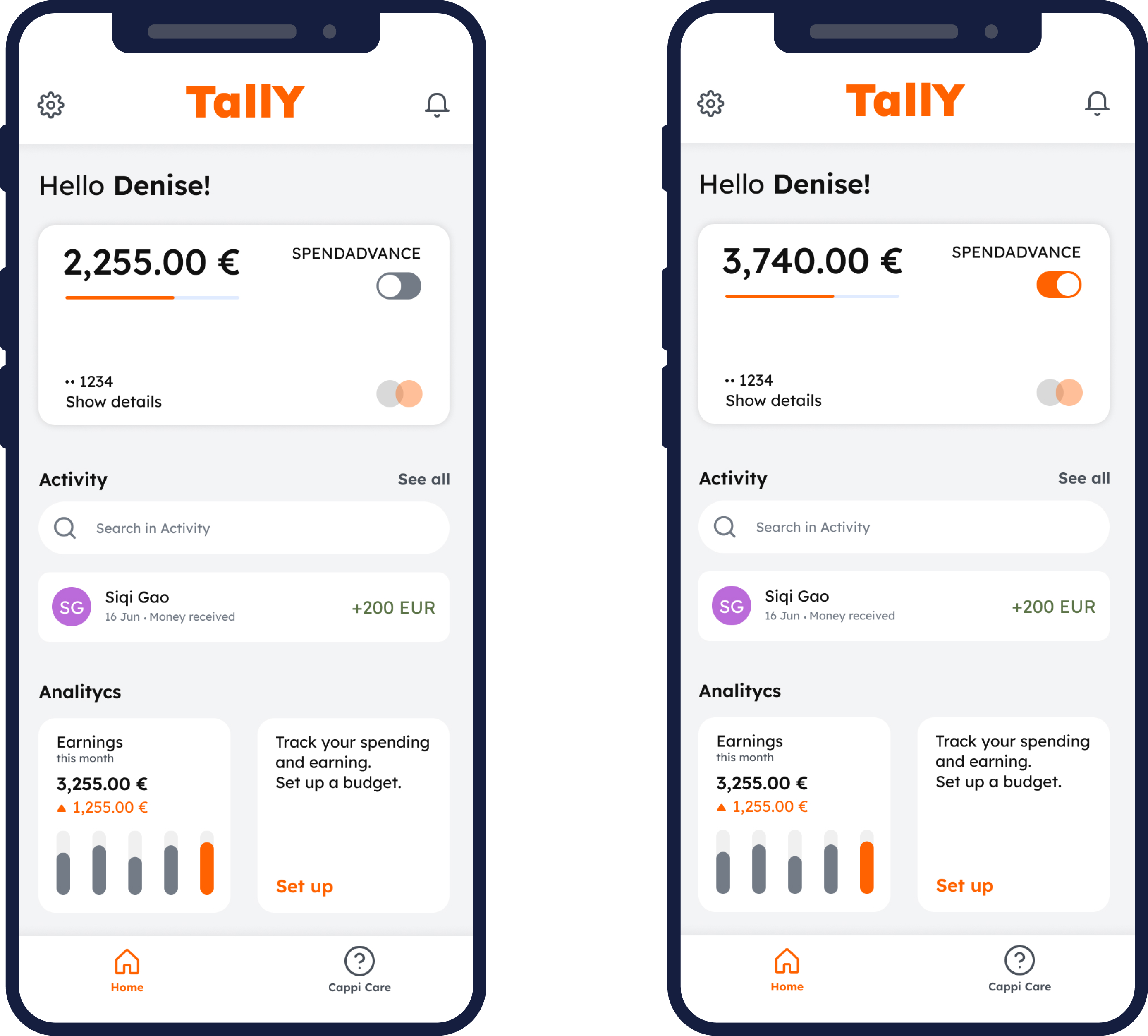
The main goal was to allow users quickly get their payments on demand. The home screen was designed to allow users quick access to the real and spend advance accounts.
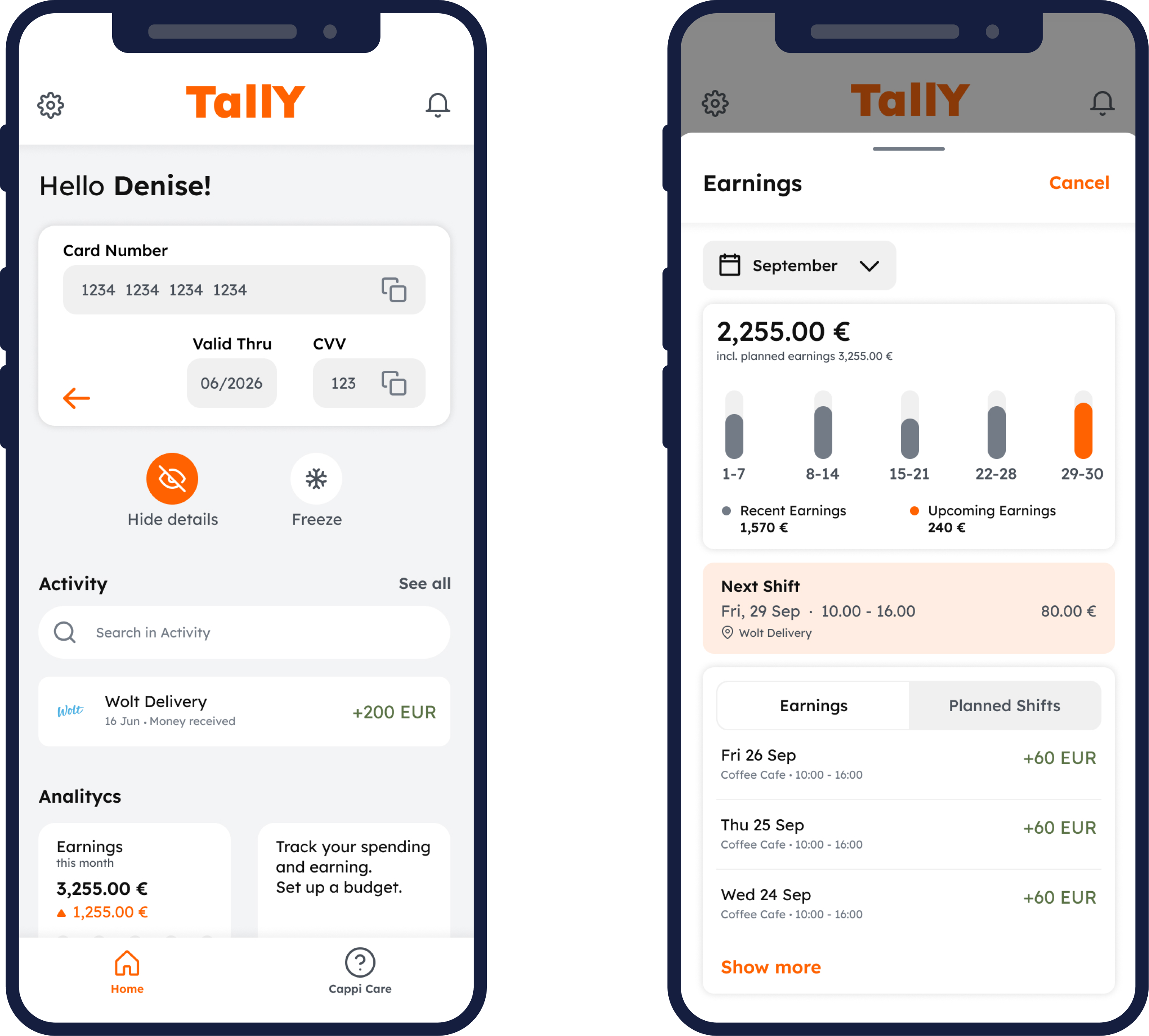
I wanted to make users feel safe both physically and emotionally. The high security of the app provides a feeling of physical safety - nobody can steal your money. Emotional security is provided by the opportunity to see and plan your earnings.
By introducing the app’s idea and a beta version, stakeholders could get investors for this product. Also, some companies are interested in this app and would like to integrate it into their payment systems. I’m looking forward to continuing working on this project!